
"Prebranding" Project
In 2020, Aspiration found itself at a crossroads: the company was simultaneously working on a major rebrand and launching a new credit card product. Both were significant initiatives that would require substantial design and engineering resources. Unfortunately, we didn’t have enough of either to fully redesign the entire product experience while also building out the new credit features.
This created a problem. As our new homepage launched alongside updated email templates and marketing materials featuring the fresh brand identity, customers would start noticing a jarring disconnect when they logged into the app. The existing Aspiration experience would look increasingly dated and out of place. And when our new credit card features eventually launched with the updated visual design, the contrast between old and new would only become more pronounced.
A “Good Enough” Bridge
The design team needed to focus their energy on solving the complex layouts, patterns, and user flows required for the credit card product. We couldn’t afford to split our attention trying to fully redesign every corner of the existing app at the same time. But we also couldn’t just ignore the problem—delivering a fragmented visual experience to our customers wasn’t acceptable.
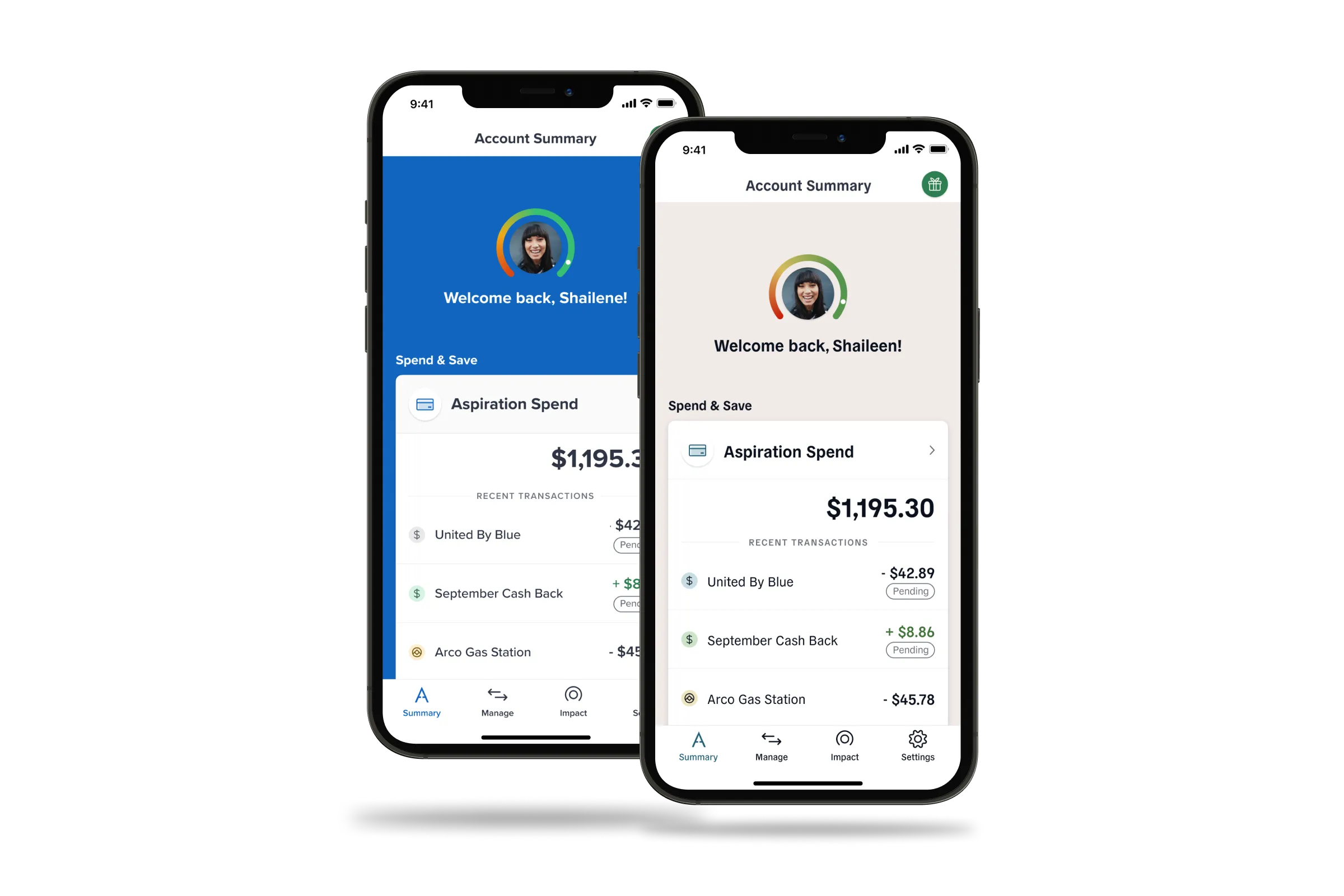
I proposed a lightweight solution I called “prebranding.” The idea was simple: apply just enough visual updates to the existing product to make it feel aligned with the new brand identity, without requiring a full redesign of every feature and flow. This would be an “as-little-effort-as-possible” project that would get us to a place where the experience was “good enough” until we had time to properly rebuild everything from the ground up.
The Technical Approach
I worked closely with our engineering team to map out a strategy. The core of the work involved gutting and replacing our global styles—colors, typography, and icons—in a systematic way. I created a clean mapping of old colors to new colors that could be applied globally across our codebases, which would handle the majority of the visual updates automatically.
However, there were about 8-10 specific instances where a simple one-to-one color swap wouldn’t cut it. For these cases—things like the dashboard background treatment and button styling—I worked with engineers to define custom changes that would better reflect the new brand’s aesthetic.
I contributed directly to the code changes across three of our web-based codebases, ensuring the updates were implemented consistently. The entire effort was intentionally time-boxed to a single sprint per developer on each platform, forcing us to be strategic and efficient about what we tackled.
Results
The “prebranding” project successfully bridged the gap between our old and new brand identities. Customers experienced a more cohesive visual journey from marketing site to logged-in product, and the design team was able to stay focused on the complex work of building out our credit card features. While we knew it wasn’t the full redesign we ultimately wanted, it bought us the time and space to do that work properly when the moment was right.
← Back to all projects